Optilyz is a B2B web application that allows marketing professionals to
book, manage and optimise direct mail campaigns (addressed postal
marketing).
My role
As the only designer I was responsible for all design activities:
conceptual design, prototyping, research, UI design, graphic assets
and support during implementation.
Problem
Direct mail is an unfamiliar marketing method in times when digital
marketing is mainstream. The communications have to be designed,
printed and posted, and the process can be chaotic and complex to
organize.
Optilyz developed a web app to manage this process and remove the
constraints associated with it.
Design goals
Our main goal was to give customers full control of their direct mail
initiatives and eliminate the difficulties that the fragmented direct mail
process entailed.
To achieve this we put emphasis on
providing customers with the resources and information they
need
to understand the channel and on
creating an intuitive booking process that enabled
customers to configure campaigns without assistance.
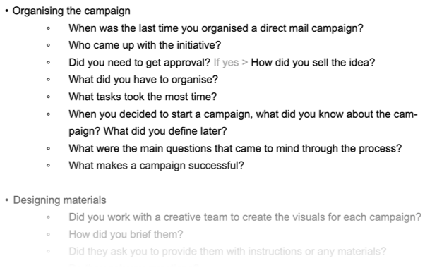
Research
Customer feedback was a key component of the design process that
helped us understand their level of awareness about direct mail, their
priorities and their struggles with it. I conducted customer
interviews but also regularly received valuable insights from the
sales and customer support teams.
Excerpt from a research guide
This was an on-going effort from which we identified pain-points and
critical questions to answer.
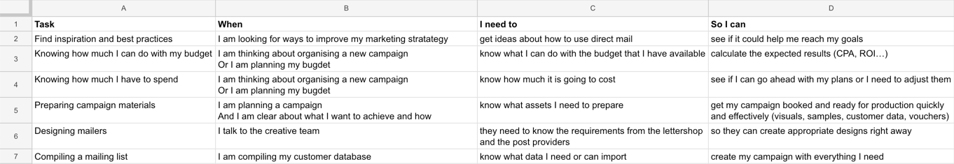
List of user needs summarizing insights from internal and external
sources
On-boarding
Shortening the learning curve
I worked to anticipate the customer questions during the on-boarding
process, making the most relevant information and materials easily
accessible.
Unexperienced users needs
Understand what the application is about and what they can do
Understand how direct mail can help them increase conversions and
how they can apply it to their business.
Know where to start from and how to progress through a campaign
setup
Existing customers needs
Understand what is required for the type of campaign they want to
run (ie: how to do personalize the mail this or that way)
Have easy access to the resources they need (like layout
templates)so they dont have to re-work their materials after
they've started a campaign
Summary of user needs that I designed for
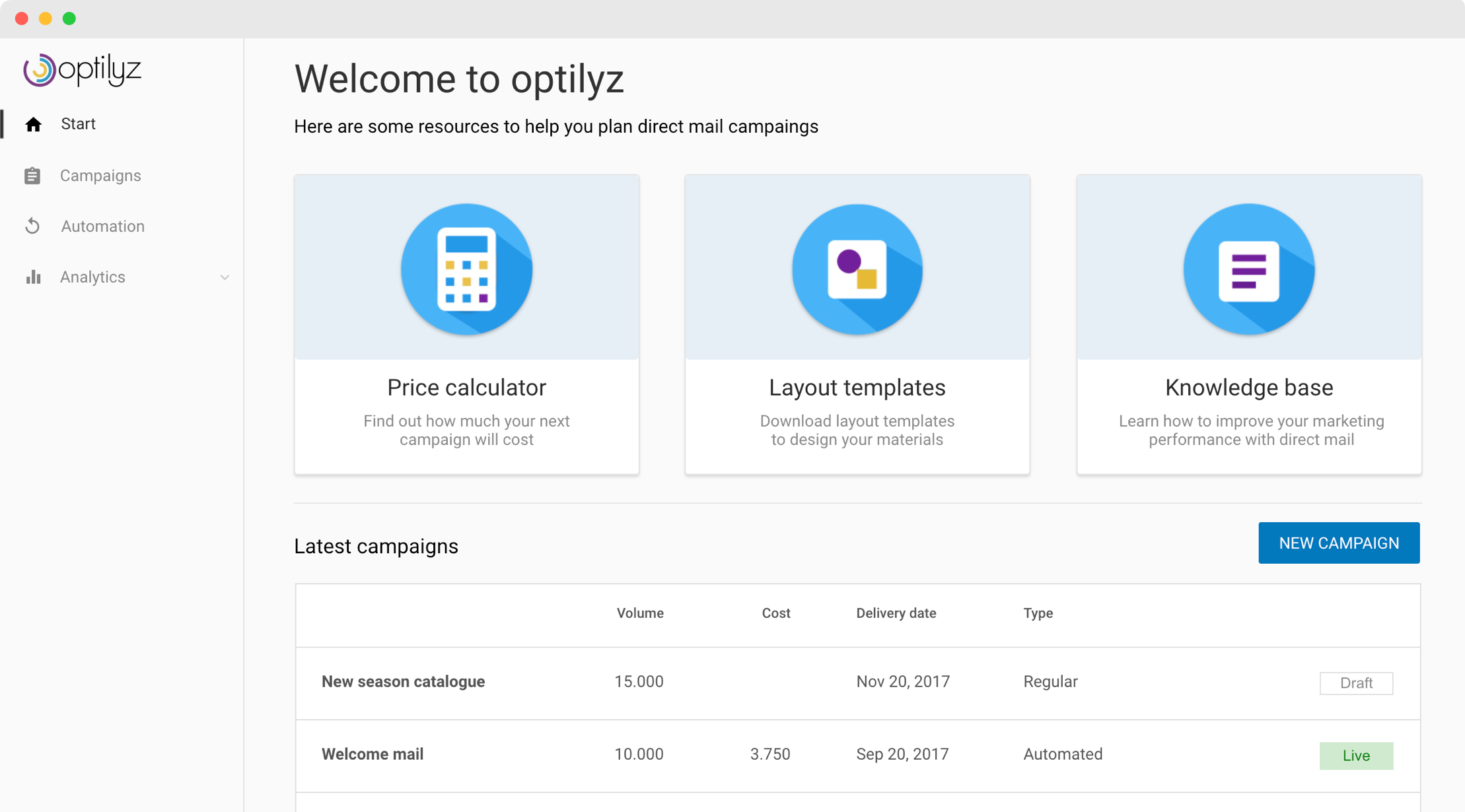
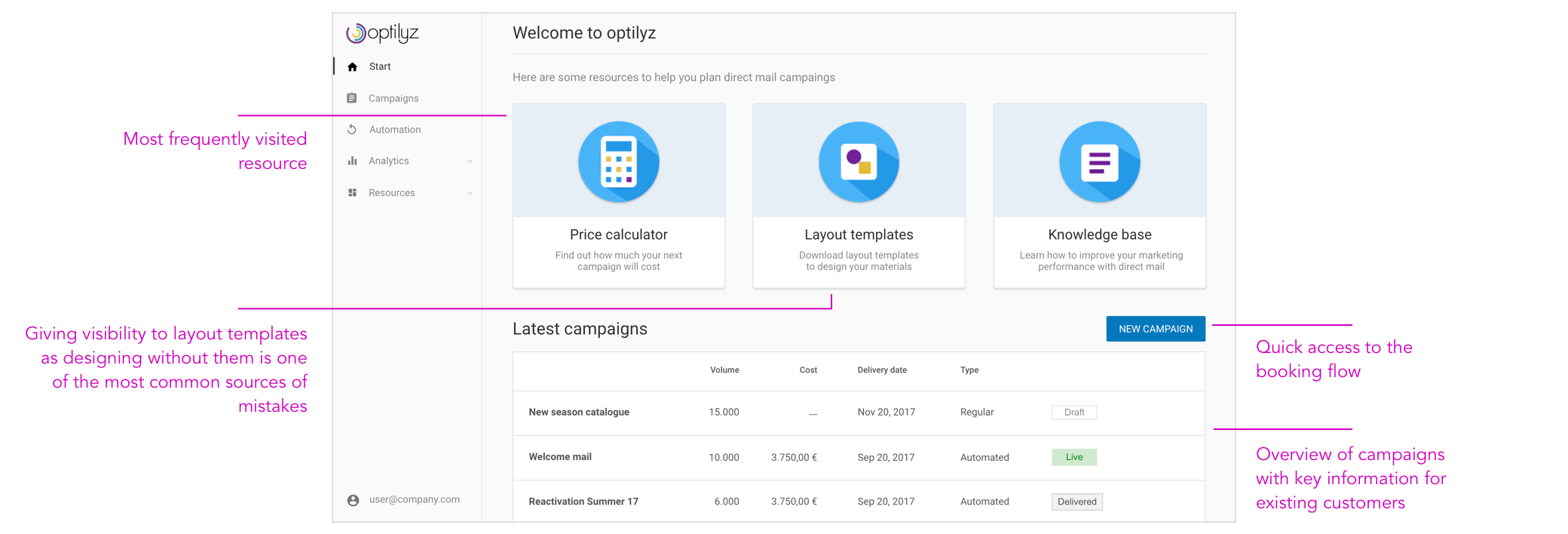
Landing page
I took advantage of blank states to translate them into informative
screens.
An empty state
I participated creating a knowledge base writing articles and
designing collateral help materials.
And designed a concept for a contextual help system that would
prioritize topics related to the user goals and would always be
available without interfering with the user task. Due to business
priorities this project didn't progress beyond the concept stage.
Concept for a contextual help system that recommends more relevant
help topics based on the task the user is performing
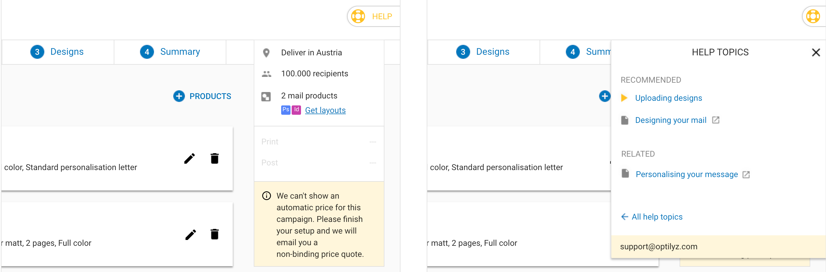
Giving users the information they needed to make informed decisions
was one of the key areas of focus. During user research sessions we
listened with special attention to the words and descriptions that the
customers used, as part of the effort to keep the language and subject
specific terms plain and user focused. We also include iconography to
increase recognition and ease the process of reviewing the
configuration for their campaign products.
The product configuration flow includes visual hints to help
understand the different option
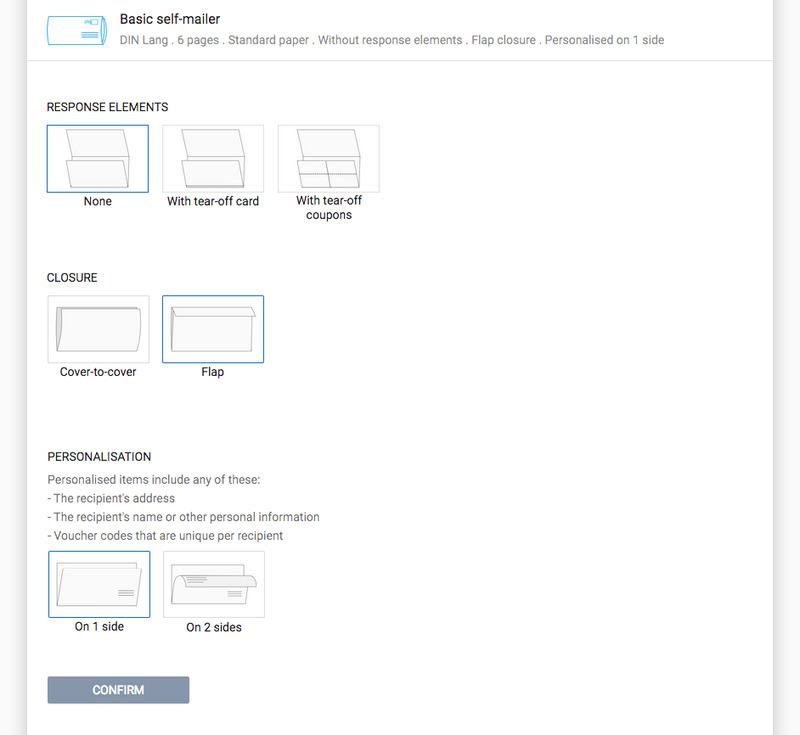
Booking process
Introducing mail packages
As the number and size of Optilyz customer grew, the desired campaign
setups became more complex. The platform used to allow to send 1 mail
piece per campaign (for example, a postcard or a letter) but some
customers started to request deliveries of several pieces together
(for example a postcard and a letter together in an envelope).
We adapted the campaign booking flow to allow customers to organize
campaigns in which to send several mail pieces to their customers.
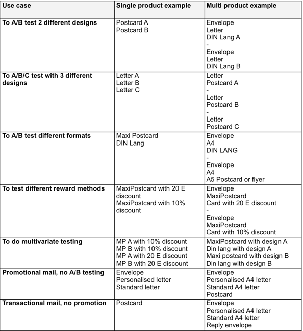
In collaboration with sales and business stakeholders we analysed the
most common campaign setups and identified the main use cases we
should design for.
Gathering information about most common use cases
Our 2 main areas of focus were allowing users to combine and configure
mail products according to their needs and allowing customers to
upload designs and define discount codes.
Design approach
I run a team ideation workshop and from there I developed design
concepts that we then used as stimuli for user research.
We tested 2 different prototypes in parallel. We started doing
internal usability tests with colleagues and moved on to more
elaborated research sessions. We dismissed design concepts that
weren't working, iterated on the best ideas and tested them again.
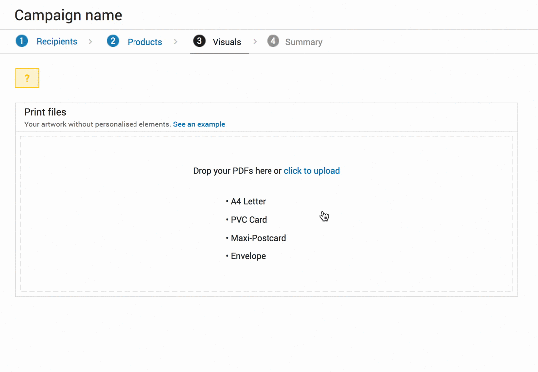
A version of the upload function that we dismissed during user testing
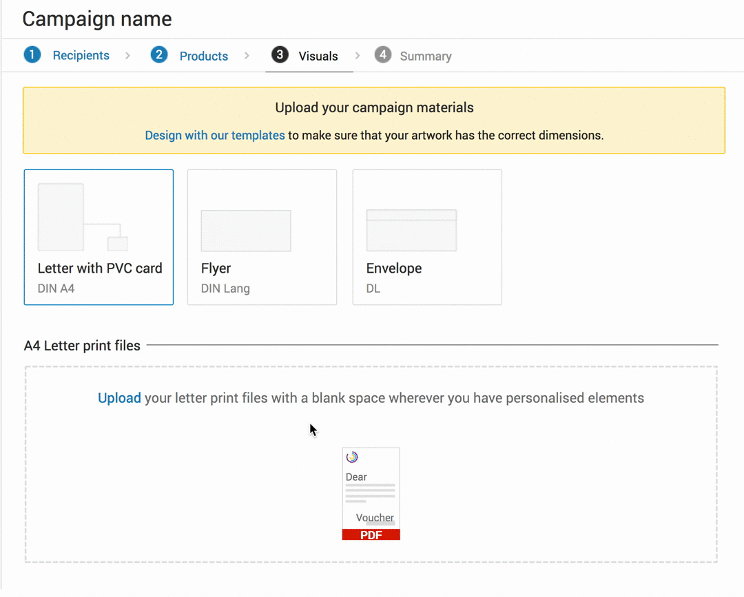
Another version of upload function that we iterated upon
One of the key learning points was that
customers valued confidence over speed. Making sure
they haven't missed anything and being confident that the information
had been processed correctly, were common patterns we observed during
user research.
We tried to reduce complexity, simplifying the booking flow and giving prominence to the principal
tasks while making non-required options available in an non-intrusive
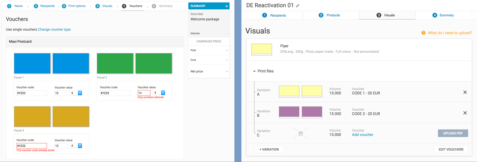
way. An example is the voucher screen which used to be a completely separate step in the process. We made the decision to integrate it with the
visuals upload.
Old vouchers screen (left) that users needed to go through even if they were not using them.Simplified booking flow with the vouchers integrated on the visual upload step (right)
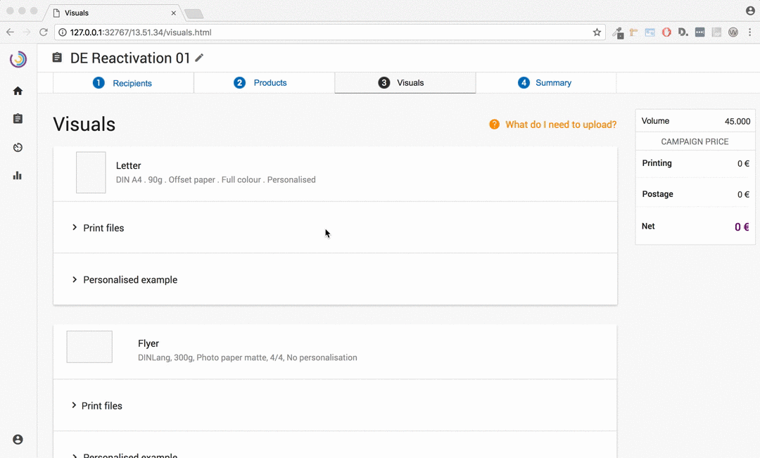
We used a one thing at a time approach to guide users through complex
tasks, breaking down the tasks into smaller steps so the users could
focus on a single action.
The process of uploading visuals and adding vouchers broken down in smaller steps that ask the users to make one decision at a time only.
Takeaways
Usability testing was an essential part of the process but on large projects it can be difficult to test all the details. In those cases it is important to identify the critical journeys first and focus on increasing confidence on those before release.
Whether it is in meetings, workshops or kitchen conversations talking to the colleagues who have frequent contact with customers will always bring good UX insights. Likewise doing internal usability tests worked well for us to identify some usability problems before reaching out to customers.
During spontaneous conversations or
review meetings it is easy to want to respond quickly to
change requests or suggestions, but very likely any change will have an implication somewhere else, even if it is not immediately obvious. I've learned that often it is necessary to hold off and take time to thoughtfully consider changes and identify their implications.